.png)
Email Now: hello@quillmarketing.com

Email Now: hello@quillmarketing.com
You’ve invested time, money, and energy into driving traffic to your site. Your SEO is humming, your social media ads are clicking, and the "users" column in your analytics is finally climbing. But then you look at your inbox. It’s quiet. Too quiet.
If your traffic is high but your inquiries are low, you are likely suffering from website mistakes that kill leads.
In the digital-first economy of 2026, your website isn’t just a brochure; it’s your 24/7 salesperson. Imagine it as a human salesperson: if your salesperson is confusing, slow, or self-centered, your prospects will walk out the door without a word. They might even leave a nasty Yelp review!
Fixing these issues isn't just about "cleaning up the site"—it’s about turning a passive gallery into a conversion engine.
Here is a deep dive into the critical errors that are probably sabotaging your growth and how to fix them.
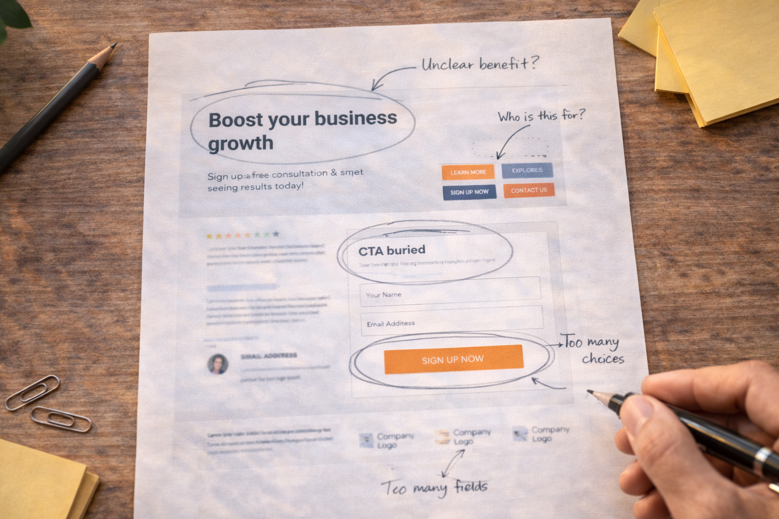
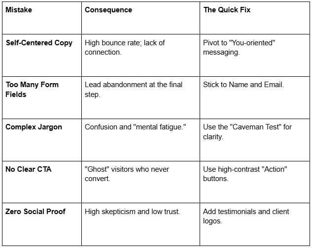
The biggest mistake businesses make is assuming the visitor cares about them. Your "About Us" section or your homepage hero banner should not lead with "We have been in business for 20 years."
Period. End of story.
In reality, prospects visit your site with one question: "Can you solve my problem?" When your messaging focuses on your own accolades rather than the visitor’s pain points, you create a disconnect. This is one of the primary website mistakes hurting conversions.
The Fix:
We’ve all seen them: the contact form that asks for a phone number, company size, annual revenue, and "how did you hear about us" before the user can even ask a simple question.
Every extra field you add to a form decreases the likelihood of completion. If you are wondering why websites don’t generate leads, look no further than your "Contact" page. If it feels like a tax audit, people will bail.
The Fix:
When you are an expert in your field, it’s easy to use industry shorthand. However, your lead is likely not an expert. If your headline reads "Synergistic Paradigms for Omnichannel Scaling," your visitor’s brain has to work too hard to decode it.
When a brain has to work too hard, it leaves. This is a classic common website conversion mistakes trap—choosing "clever" over "clear."
The Fix:
In 2026, mobile-first isn't a suggestion; it’s the law. Yet, many sites still suffer from website design mistakes that prioritize the desktop experience. If a user has to "pinch and zoom" to read your text or if your "Call to Action" (CTA) button is too small for a thumb to hit, you’ve lost the lead.
The Fix:
You cannot expect a visitor to know what to do next. If they finish reading a blog post or a service page and there is no clear instruction on the next step, they will simply close the tab.
Website mistakes that kill leads often involve the "passive" approach—hoping the user finds the "Contact" link in the footer.
The Fix:
Modern users scan; they don’t read. If your website is a dense forest of paragraphs, users will bounce. Visual fatigue is a real conversion killer. Large blocks of text feel like "work," and your visitors are looking for a "solution."
The Fix:
In a world of digital scams and empty promises, trust is the primary currency. If your site lacks testimonials, case studies, or logos of past clients, you are committing one of the most avoidable lead generation website mistakes.
People don’t want to be the first person to try your service; they want to be the next person to succeed with it.
The Fix:
You have roughly three seconds before a visitor loses interest. If your high-resolution images aren't optimized or your hosting is sluggish, your leads are dying before they even see your headline. Speed is a technical issue, but it has a massive psychological impact on brand perception.
The Fix:
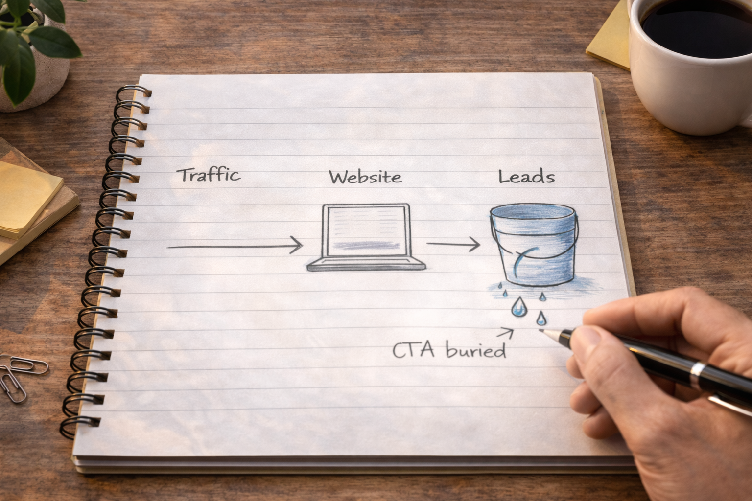
Identifying website mistakes that kill leads is only the first half of the battle. The second half is execution. Every day your site remains unoptimized is a day you are essentially paying for traffic and then throwing it away.
Think of your website as a bucket. If the bucket is full of holes, it doesn't matter how much water (traffic) you pour into it; it will never be full. Patching these holes—the messaging, the speed, the friction—is the only way to ensure your marketing budget actually results in a return on investment.
Most business owners are too close to their own brand to see these flaws clearly. They see what they meant to say, not what the customer actually sees. To truly fix the website mistakes that kill leads, you need to look at your site through the eyes of a skeptical, busy, and slightly impatient stranger.
When you remove the friction, clarify the message, and prove your worth, your website stops being a cost center and starts being your most valuable asset.
Your website should be your hardest-working employee, not a digital paperweight. If you’re tired of seeing high traffic numbers but empty contact forms, it’s time for a professional perspective.
At QuillMarketing.com, we specialize in identifying and fixing the friction points that stand between you and your next big client. From messaging overhauls to conversion-centered design, we turn "ghost" visitors into loyal customers.